Monday, September 6, 2010
URW Learn Forum Set Tutorial
Posted by WillowRaven at 5:00 PM 0 comments
Labels: filters , Forum Tag , FTU artist , FTU filter , FTU Licensed Artist , MTA FTU Artist , No Scraps , tag made , tutorial
Sunday, August 1, 2010
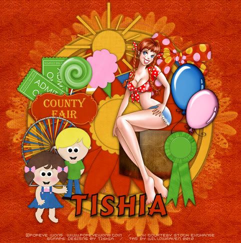
County Fair Tutorial
Posted by WillowRaven at 1:17 AM 0 comments
Labels: CT , Designers , Designs by Tishia , FTU artist , PTU kit , tag made , tutorial
Tuesday, July 27, 2010
For the Love of Alysia Tutorial
This is the tag we will be making:
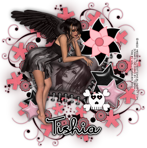
Moderate level - Some knowledge of PSP is needed.
Materials Needed:
Paint Shop Pro (used Version 9, but can be done on any version)
PTU kit "Alysia" by Designs by Tishia which can be bought at Scrappin Bratz
Posers used from the kit, by Medi
Mask #03 by Yez
Filters Needed:
Blinds (comes with PSP)
Optional Filter: Eye Candy 5 Impact Gradient Glow (used for my name/text)
Fonts used:
FFF Professional (for copyright info)
Mrs Blackfort (for name/text)
Please note that I will give the drop shadow settings that I have used HOWEVER feel free to use your own settings if you would like.
1. Open PSP. Open New File: 600 pixels x 600 pixels, 72.000 pixels/inch resolution, transparent. At this time, also open your mask and minimize in PSP.
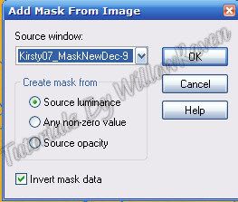
2. Open Paper 3... copy & paste it as new layer. Resize it 75%, be sure "resize all layers" is UNchecked. Go to Layers - New Mask Layer - From Image and use these settings:
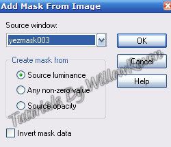
Go to your layer palette, right click on the background paper layer, then go to Merge - Merge Group. Duplicate layer, then go the bottom duplicate and go to Adjust - Blur - Gaussian Blur with a blur of 25.00, click OK. Go to the top of the 2 and apply the following drop shadow:
Vertical and Horizontal: 0
Opacity: 75
Blur: 8.00
Color: black
Shadow on new layer: unchecked
3. Open one of the frames in the kit (I used Frame 3). Copy and paste as new layer then resize it 60% (be sure "all layers" is UNchecked). It should already be centered within the stars from the mask, which is good because that is where you want it. Feel free to apply your favorite drop shadow at this point (or wait til end and apply as desired).
4. Open one of the hearts in the kit (I used heart 3). Copy and paste as new layer then resize it 90% (be sure "all layers" is UNchecked). The go to Image, Rotate - Free Rotate and use these settings:
Direction: left
Degrees: free, 25.00
All Layers: unchecked
Rotate single layer around cavas: unchecked
then move the heart to just below the frame layer and center and sharpen, as needed.
5. Open one of the swirls in the kit (I used swirl 1). Copy and paste as new layer then resize it 85% (be sure "all layers" is UNchecked). Move this to just above the blurred mask layer. Apply following drop shadow settings:
Vertical and Horizontal: 0
Opacity: 75
Blur: 4.00
Color: black
Shadow on new layer: unchecked
6. Move heart (my heart 3) to above the frame, and resize it by 85% (be sure "all layers" is UNchecked). Click on the inside of the heart with your magic wand. Go to Selections - Modify - Expand ....by 5.00 pixels - click ok.
7. Copy and paste one of the tubes you are using (you will want one with a close up of the face, or a clear image of the face - I used thefallen3). Copy and paste, then center it above the heart (resize as needed too). When you are satisfied, go to Selections - Invert and then click on the Delete key. Go to Selections - Select None. Go to the layer palette and right click on the layer with the face. Go to Properties and use these settings:
Blend Mode: Luminance (Legacy)
Opacity: 75%
Link Set: 0
Layer is Visible: checked
Lock transparency: unchecked
Highlight in layers palette: unchecked
8. Copy and paste poser thefallen5. Go to Image - Mirror. Resize by 60% (be sure "all layers" is UNchecked) then move it around so that she is standing to the left of the heart (see my tag for placement idea). Apply your favorite drop shadow setting.
9. Go to the blurred mask layer, make active. Go to Effects - Texture Effects - Blinds and apply these settings:
Width: 5
Opacity: 85
Color: black
Horizontal: unchecked
Light from left/top: unchecked
10. At this point, continue to decorate the tag as desired with supplied elements. When you are satisfied, resize to 500 pixels x 500 pixels, "all layers" CHECKED. Feel free to use the crop tool to crop out any additional edges from the tag.
11. Apply crediting information and watermark. Apply and desired drop shadows to the layers. When satisfied, merge visible. Apply name text and then you are done!
Thank you so much for checking out my tutorial and I would love to see your results if you try it!
Posted by WillowRaven at 12:37 AM 0 comments
Labels: CT , Designers , filters , FTU artist , FTU filter , PTU kit , ScrappinBratz , tag made , tutorial
Sunday, July 18, 2010
Come Sail Away!!
Here are the tags I made for Tishia: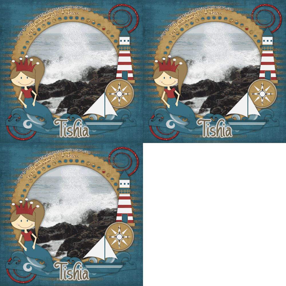
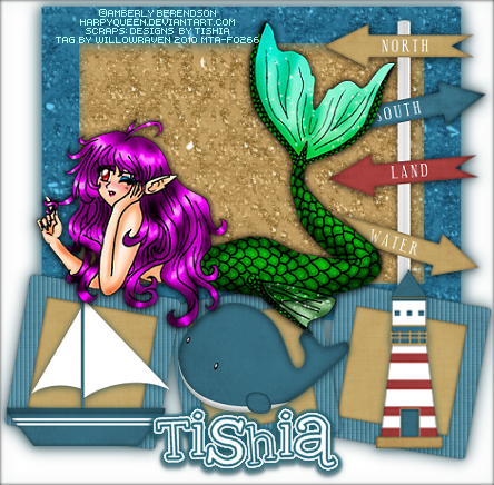
Thanks to Tishia for allowing me to use her wonderful, creative kit!!
If you like what you see, head on over to the store and grab it. Tishia also has a lot of other wonderful creations to choose from.
Posted by WillowRaven at 3:57 PM 1 comments
Labels: CT , FTU artist , Info , News , PTU kit , ScrappinBratz
Tuesday, June 29, 2010
Shamrock Pixie Tutorial
This is the tag we will be making
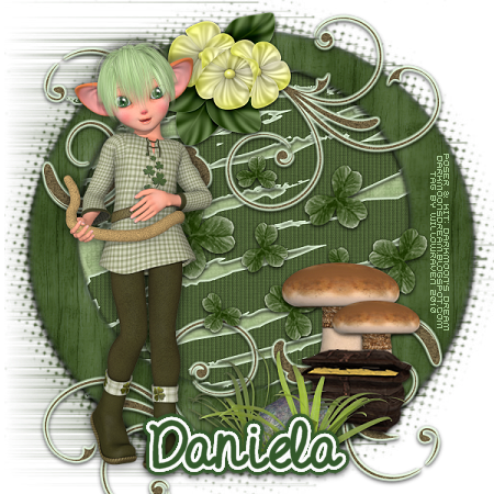
Moderate level - Some knowledge of PSP is needed.
Materials Needed
Paint Shop Pro (used Version 9, but can be done on any version)
PTU kit "Shamrock Pixie" by Darkmoon's Dream Designs which can be bought at Scrappin Bratz
Poser used from the kit
Filters Needed
Xero-Porcelain - FTU filter
Blinds (comes with PSP),
Optional Filter
Eye Candy 5 Impact Gradient Glow
Fonts used
FFF Fuego (for copyright info)
Doodle Journal - PTU font (for name/text)
Please note that I will give the drop shadow settings that I have used HOWEVER feel free to use your own settings if you would like.
1. Open PSP. Open New File: 600 pixels x 600 pixels, 72.000 pixels/inch resolution, transparent. At this time, also open your mask and minimize in PSP.
2. Open one of the frames in the kit (I used Frame04). Copy and paste as new layer on your blank "new file" then resize it 80% (be sure "all layers" is UNchecked). Copy and paste Paper14 as new layer then resize it 70% (be sure "all layers" is UNchecked). Move to just below your frame layer. Click inside the frame making sure that the entire area inside is clicked, then close off the frame layer, then make the paper layer active. Go to Selections - Select All, Selections - Float, Selections - Defloat. The go to Selections - Modify - Expand - by 10 pixels - then click OK. Go to Selections - Invert and then click your Delete key. Selections - Select None and then click on the frame layer, making it visible again. Go to Selections - Select All, Selections - Float, Selections - Defloat then apply your Xero/Porcelain effect using the following settings:
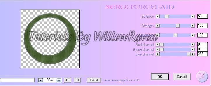
Go to Selections - Select None (to remove marching ants).
3. Copy and paste Paper14 as new layer then resize it 75% (be sure "all layers" is UNchecked). Move to just below your frame background layer. Go to Layers - New Mask Layer - From Image and apply these settings:
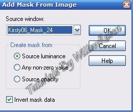
Go to the layer palette - right click on the "Group - Raster 2" layer, Merge - Merge Group. Feel free to close the mask that you have minimized.
4. Copy and paste one of the pixies (I used Pixie01) as new layer then resize it 35% (be sure "all layers" is UNchecked). Move to top in the layer palette. Move to left side of tag (see my tag for idea).
5. Copy and paste the mushroom as new layer then resize it 25% (be sure "all layers" is UNchecked). Move to just below the pixie layer. Duplicate then resize the duplicate by 75% (be sure "all layers" is UNchecked), then place them as shown on tag. Do the same thing with one of the chests (I used Chest02) - resize to 35% instead, and do not duplicate - and move that to the layer between the pixie and the mushroom.
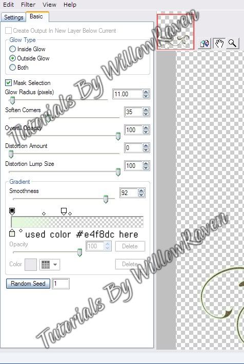
6. Copy and paste one of the swirls (I used Swirl01) as new layer then resize it 60% (be sure "all layers" is UNchecked). Move it to layer just under the mushroom, then place it behind his head (as shown on tag). Duplicate swirl, then go to Image - Flip, then Image - Mirror. Move the swirl around til it is placed somewhat on the right bottom of the frame (see my tag for idea). If desired, resize the bottom swirl by 85% - some of it still might run off the area, that is ok. Use Eye Candy 5 Impact, Gradient Glow and these settings:
7. Copy and paste Splatter01 as new layer then resize it 60% (be sure "all layers" is UNchecked). Move to just below your frame layer, then move it around so it is somewhat centered under the frame. Go to Effects - Texture Effects - Blinds and use the following settings:
width: 5
opacity: 25
color: black
horizontal: unchecked
light from left/top: unchecked
Then go to Adjust - Brightness and Contrast - Brightness/Contrast and use these settings:
brightness: 15
contrast: 0
Go to Eye Candy Impact, Gradient Glow and use the previous settings.
8. Copy and paste Shamrocks01 as new layer then resize it 50% (be sure "all layers" is UNchecked) then go to Image - Rotate - Free Rotate using these settings:
Direction: right
Degrees: 90
All Layers: unchecked
Rotate Single layer around canvas center: unchecked
Center it (somewhat) within the frame, as seen on my tag. Sharpen, if needed.
9. Copy and paste Grass03 as new layer then resize it 40% (be sure "all layers" is UNchecked), then place it just above the mushroom layer.
10. Copy and paste Flower07 as new layer then resize it 35% (be sure "all layers" is UNchecked), then place it just above the top swirl layer, as seen on the tag.
11. Apply drop shadow to all layers (except mask layer and pixie layer) with these settings - or your preferred settings:
vertical: 2
horizontal: 0
opacity: 75
blur: 7.00
color: black
shadow on new layer: unchecked
(note: on frame layer, I applied the drop shadow twice)
On the pixie layer, use the following settings:
vertical: 0
horizontal: 0
opacity: 70
blur: 20.00
color: black
shadow on new layer: unchecked
(note: I didn't apply a drop shadow on the mask layer, however you may if you prefer.)
12. At this point, feel free to decorate further, using elements in the kit. When you have it all decorated, go to you layer palette, right click, then Merge - Merge Visible all the layers. Then resize to 450 pixels x 450 pixels - all layers checked. Go to Adjust - Sharpen. (You might need to do this more than once.)
13. Apply copyright information and tagger watermark. (I used Pixelette for mine.)
14. Merge Visible, save in .png format (to retain background transparency).
15. Apply name and place in center of bottom of frame area (see my tag for idea). For mine I used the font Doodle Journal, with #33582a as my foreground and background colors. I did stroke 3.0 and size 48 on the font, and used the following Eye Candy 5 Impact - Gradient Glow settings:
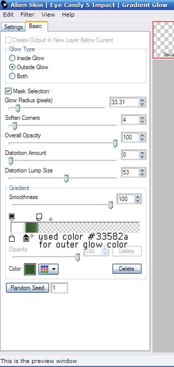
and then did the following drop shadow settings:
Vertical: 2
Horizontal: 0
Opacity: 75
Blur: 8.00
Color: Black
Shadow on New Layer: Not checked
And that's it!!
Thank you so much for checking out my tutorial and I would love to see your results!
*~*~*~*~*~*~*~*~*~*~*~*
Check out this wonderful result from Lorri, a fellow member on the Shewolf's Domain groups:
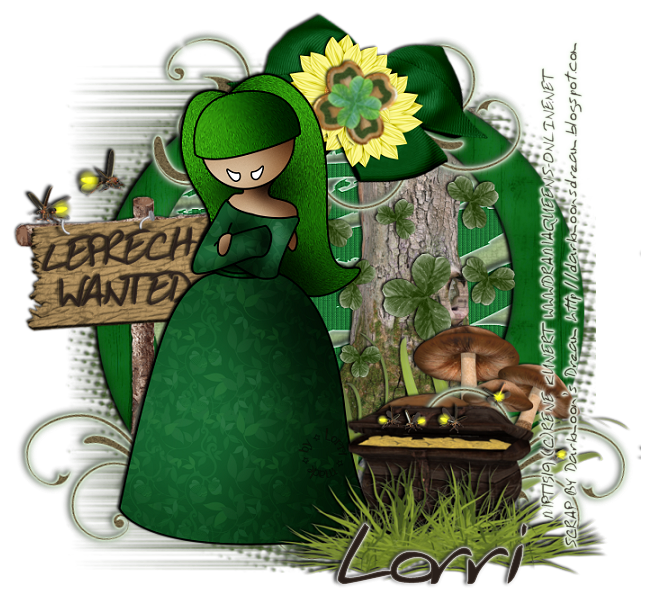
Absolutely amazing! Thank you Lorri, for sharing your result!!
Posted by WillowRaven at 6:08 PM 1 comments
Labels: CT , filters , FTU filter , PTU kit , ScrappinBratz , tag made , tutorial
Saturday, June 26, 2010
Swan's Flight
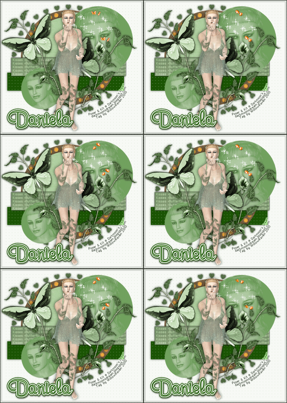
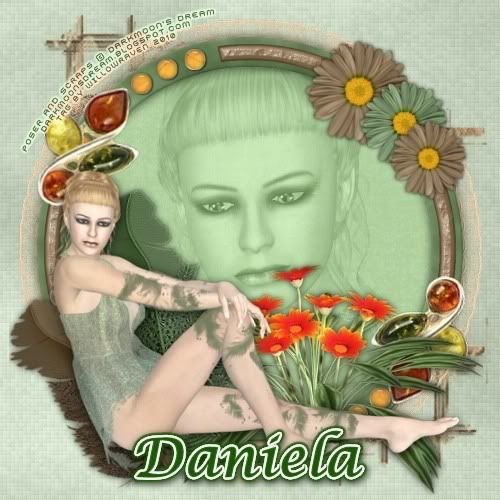
If you like what you see, be sure to stop by the store Scrappin' Bratz and check it out!
Posted by WillowRaven at 3:07 PM 1 comments
Labels: CT , Info , News , PTU kit , ScrappinBratz , tag made
Monday, May 31, 2010
Atomic Bop Tutorial
This is the tag we will be making:

Moderate level - Some knowledge of PSP is needed.
Materials Needed
Paint Shop Pro (used Version 9, but can be done on any version)
PTU kit "Atomic Bop" by Immortal Dreams which can be bought at Scrappin Bratz
Poser from Lisa at Sophisticated Scraps
Chelle/WeeScotsLass Mask #127
Tag Template #34 from Kristin at Toxic Desirez
Gradients teom_085 and teom_130 (provided HERE)
Filters Needed: Eye Candy 4000 Glass and Eye Candy 5 Impact Gradient Glow
Fonts used: copy 10_56 (for copyright info), Tattoo Ink (for name/text)
1. Open PSP. Open tag template, click on Shift +D to duplicate, then close original. Delete the crediting layer. At this time, also open your mask and minimize in PSP.
3. Go to AB-Paper 10 from the kit - Copy, then go to the template and Paste as New Layer right above the Bars layer. Rename it Paper 10. Resize (Image - Resize) 65%, All Layers UNchecked.
3. Make Bars layer active then go to Selections - Select All.... Selections - Float .... Selections - Defloat. You will now have marching ants around the bars. Make the Paper 17 layer active by clicking on it.
4. Selections - Invert. Click on the Delete Button. Paper 10 should now be where the bars now are/were. Go to Selections - Invert. Now the inside of the bars is active again.
5. Apply the following drop shadow:
Vertical and Horizontal: 0
Opacity: 75
Blur: 12.00
Color: black
Shadow on new layer: unchecked
Go to Selections - Select None. Delete the bars layer.
6. Go to AB-Paper 15 from the kit - Copy, then go to the template and Paste as New Layer right above the Circle layer. Rename it AB-Paper 15. Resize (Image - Resize) 65%, All Layers UNchecked.
7. Make Circle layer active then go to Selections - Select All.... Selections - Float .... Selections - Defloat. You will now have marching ants around the circle. Make the Paper 15 layer active by clicking on it.
8. Selections - Invert. Click on the Delete Button. Paper 15 should now be where the bars now are/were. Go to Selections - Invert. Now the inside of the circle is active again.
9. Apply the following drop shadow:
Vertical and Horizontal: 0
Opacity: 75
Blur: 12.00
Color: black
Shadow on new layer: unchecked
Go to Selections - Select None. Delete the circle layer.
10. Click on the crop tool and go to Merged Opaque. Move the cropping window around so you crop away the drop shadowing along the outer edges of the template. Click the check mark to crop.
11. Make Notes layer active then go to Selections - Select All.... Selections - Float .... Selections - Defloat. You will now have marching ants around the notes. Add new raster layer right above the notes layer, then flood fill with the gradient teom_085. (In the gradient palette, use these settings: Angle 45, repeats 6, radial).
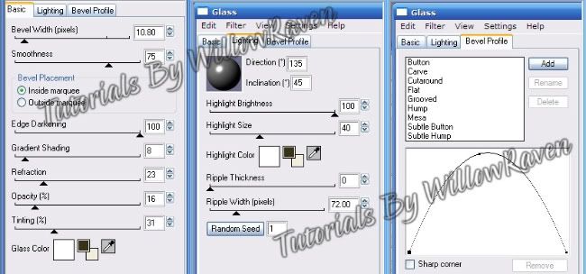
12. Using Eye Candy 4000, Glass, apply these settings:
Use the following drop shadow:
Vertical and Horizontal: 0
Opacity: 75
Blur: 8.00
Color: black
Shadow on new layer: unchecked
13. Do the same thing with the stars, using gradient teom_130. (The only change is, when using the Eye Candy 4000 filter, change the bevel profile to button.)
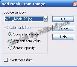
14. Click on the background layer. Take a paper of your choice (I used AB-Paper 12) and copy and paste as new layer just above the background layer. Resize (Image - Resize) 70%, All Layers UNchecked. Go to Layers - New Mask Layer - From Image and use these settings:
11. Go to Layer Palette, click on the Group - Raster 3. "Right click", go to Merge - Merge Group. Resize (Image - Resize) 110%, All Layers UNchecked. Apply drop shadow used on papers layer.
12. Copy and paste poser from kit - place it in the center of the tag. Resize (Image - Resize) 70%, All Layers UNchecked. Line up her legs along the lower areas of the bars. (see my tag for idea) Move the poser layer to just under the Words layer.
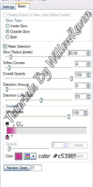
13. Do with the words layer the same steps you took for the stars. (You might need to zoom in to flood fill the letters. If you do, remember to zoom back to 100% when you are done.) When done, go to Eye Candy 5 Impact, Gradient Glow and apply the following settings:
Apply the following drop shadow:
Vertical and Horizontal: 1
Opacity: 75
Blur: 5.00
Color: black
Shadow on new layer: unchecked
14. At this point, apply elements as desired. (You may need to move your poser around - do so as needed/desired.)
15. Apply © information, scrap designer, tagger watermark on new layer. When happy with the look, merge visible.
16. Apply name/text to tag.
And you are done!
Thank you so much for checking out my tutorial and I would love to see your results if you try it!
Posted by WillowRaven at 6:48 PM 0 comments
Labels: CT , Designers , filters , FTU artist , PTU kit , tutorial
Tuesday, February 16, 2010
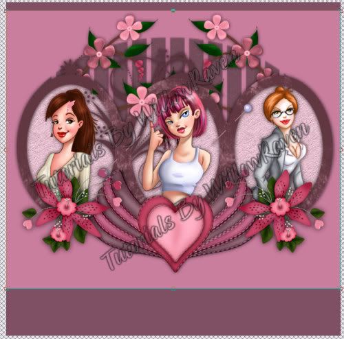
Popeye Love Tutorial
PTU kit called Game of Love by Staceys Designs which can be bought at Katelynn's Designs
Tubes by Popeye Wong which are Free To Use and can be found here (thanks Popeye!)
Mask - OvalSlatsMask.jpg – HERE
Fonts used:
2. Copy and paste the triple circle frame, do your best to center it. Feel free to close out the original.
3. Taking your preset shape tool, choose the ellipse (not the circle, but the oval), foreground and background medium gray, line width 2.0, draw an oval over one of the circles in the frame, like this:
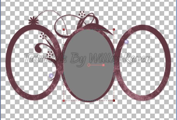
4. Copy and paste one of the papers from the kit (I am using Paper1). Feel Free to resize the paper (be sure 'all layers' is UNchecked ... I resized mine to 500 pixels x 500 pixels). Make the 3 oval layer active, then go to Selections - Select All.... Selections - Float.....Selections - Defloat. Go back to the paper layer, make active, then go to Selections - Invert, then click on the Delete key. You should now have the papers in the same area as the gray ovals. Move the paper layer below the frame layer but above the gray ovals layer.
5. Now, with the marching ants still active, copy and paste your tubes that you will be putting in the frames. When you are happy with how they are, just simply click the Delete key (since you have already Inverted the selection, it is set to delete everything outside of the frame area). Make sure that the image/tube layers are between the frame layer and the paper layer. Go to Selections - Select None.
6. Now, we have 2 frame areas that have doodles over them so we need to do something about it. Duplicate the images that are in that area, then move them above the frame layer. Take your eraser brush and use the following settings:
Size: 25
Hardness: 100
Step: 25
Density: 100
Thickness: 100
Rotation: 0
Opacity: 100
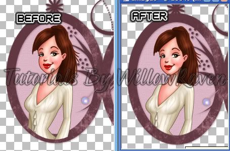
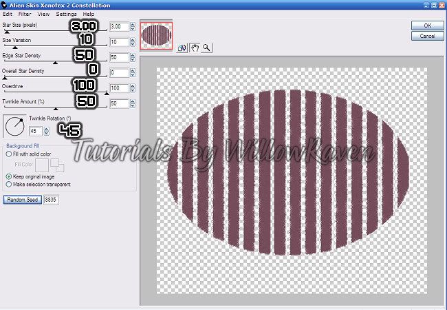
8. Go to the paper layer and make active. Go to Filters Unlimited, then Paper Textures, and choose the Filter Paper option and use the following settings:
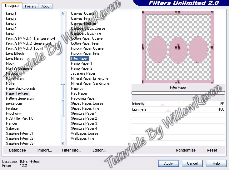
Close out the gray oval layer and the bottom layer (which should be blank) and Merge Visible everything else.
9. Move the frame up a little from the center. Take another paper and copy and paste it to the tag (I used Paper7), moving it below the frame. Resize it 600 pixels x 600 pixels (all layers UNchecked). Go to Layers - New Mask Layer - From Image and use these settings:
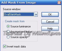
10. Take the winged heart element and copy and paste it to your tag. Bring it to the top, and resize it by 75% (all layers UNchecked) and place it under the frame, centered. Apply your favorite drop shadow to it. Take the Forget Me Nots element, resize it by 75% (again, all layers UNchecked), and move it over to behind the left side picture in the frame (see my tag for idea). Duplicate flowers, then Mirror. Erase whatever is hanging over the bottom of the frame areas. Take your selection tool and choose the upper area of both of the flower layers. Go to Edit - Copy, Edit - Paste as New Layer. (You will need to do this twice - once for each flower layer.) If needed, place them directly over their corresponding flowers. (They may copy and paste right in the same area, in which case no moving is needed.) Move both of these above the frame layer, then erase all the parts that hang over the framed images. Apply your favorite drop shadow to the bottom flower layers (not the top ones that you erased).
11. Copy and paste the decorated flower, resize by 40% (all layers UNchecked). Sharpen, if necessary. Place it below the left frame oval area and bring to top. Apply the following drop shadow:
Horizontal: 0
Opacity: 75
Blur: 15.00
Color: black
Shadow on New Layer: not checked
3. On a new raster layer, apply your copyright information, bring to top.
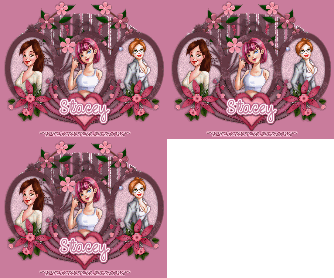
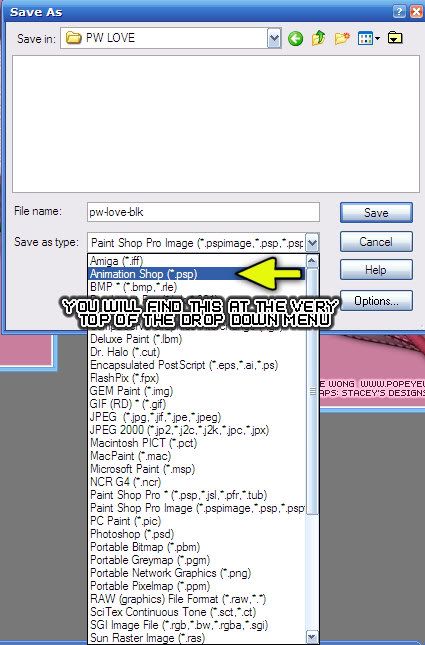
4. Ok, now - here comes the fun part. Close out the bottom 2 mask layers so that only the top one is showing. Go to Edit - Copy Merged ... Edit - Paste as New Image. Now, close out the top mask layer, and unhide the middle mask layer. Go to Edit - Copy Merged. Then go over to your other image and make it active (click on it) and go to Edit - Paste as New Layer. Now, go back to what you were working on, close out the middle mask layer and unhide the bottom one. Do the same thing that you did with the middle mask layer: Copy Merged, then go to the other image (which now has 2 layers) and click on it, then go to Edit - Paste as New Layer. You should now have 3 layers. This will be what you bring over to Animation Shop. Save as follows:
*transparent (next)
*Upper left corner of the frame, With the canvas color (next)
*Yes, repeat the animation indefinitely, 30 (next)
To check the speed of your animation, go to View - Animation. (Just click on the "X" in the upper right to stop the animation.) To Save this as a blank, go to File - Save As and save it in .gif format.
Posted by WillowRaven at 12:02 AM 1 comments
Labels: Animated , CT , Designers , filters , FTU artist , No Template , PTU kit , tag made , tutorial

