BLOGGER TEMPLATES AND TWITTER BACKGROUNDS

Saturday, December 8, 2012

MIS Snowtime Tutorial

Snowtime Tutorial

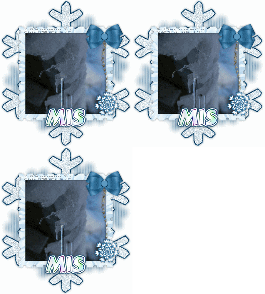
This is the tag we will be making:

Photobucket


Easy to Medium level - Basic knowledge of PSP is needed.


Materials Needed

Paint Shop Pro  (used Version 9, but can be done on any version)
Image/Photo of Choice - I used "Below Freezing" by Mis - I have her Unlimited License to use this.  If you would like to use it too, you can get this amazing image at Indie-Zine
Postage Stamp Template and Blue Snowflake "Dangle" by Me , in zipfile, HERE 


Filters Needed 

Blinds - comes with PSP
DSB Flux - Bright Noise   (or the noise filter in PSP if you don't have this filter -- settings for this filter will be in parenthesis in the area that calls for the DSB Flux filter)
VM Natural - Lightburst -- shareware, found HERE


Optional Filters (for Name/Text)

Eye Candy 4000 - HSB Noise
Eye Candy 5 Impact - Gradient Glow


Fonts used

KR Kinda Flakey (for shape)
Ambitsek (for copyright info)
Signboard Font (for name/text), (free for personal usage) 


Please note that I typically add my drop shadows last.  I will give the drop shadow settings that I have used at the end of the tutorial HOWEVER feel free to use your own settings if/when you would like.

1.  Install the font.  (Alternative:  You can open and minimize the font; it should show in PSP.  I use a font program called Cfont Pro (http://www.veign.com/application.php?appid=101) - it temporarily installs the font and will uninstall it when you shut down your computer.)

2.  Open a new file, 600 pixels x 700 pixels, 72 ppi, transparent.  Flood fill with white.  At this time, also Shift+D on your image (this will make a copy of your image) - then close out the original, then minimize it for the time being.

3.  Go to your materials palette and choose a complementary dark color as your foreground and a lighter version of that color as your background.  (I used #215475 for my foreground and #e0eff8 for my background.)  Activate your text tool with these settings:

Create as:  Vector
Direction:  Arrow Pointing Down (1st option)
Font:  KR Kinda Flakey
Size:  450
Stroke:  4.0
Alightment:  Center
Anti-Alias:  Smooth
Line Style:  Solid

(the rest of the settings don't matter for this particular part of the tutorial)

Choosing a snowflake that you like, type it out (I used Shift + F).  When happy, go to Objects - Align - Center of Canvas.  While its still in vector format, do any moving around that you might need if it doesn't fit the canvas or you wish to make any adjustments.  Once happy, convert it to raster.

4.  Go to the stamp template, and copy and paste the following layer to your snowflake file:  white stamp cutout (should be the layer directly under "black insert").  If not already, move it to the layer above your snowflake.  Close out the snowflake layer, then go back to the stamp template layer.  Using your magic wand tool, click on the inside of the stamp.  Go to Selections - Modify - Expand .. by 6.0 pixels.  Go to your image and resize if needed (I ended up having to size mine down to 425 pixels x 637 pixels so that it would fit decently in the stamp frame.)  Move the image around so that the part you want in the frame is within the marching ants.  Once satisfied, go to Selections - Invert then click on your "Delete" button.  Selections - Select None.  Move image just under the stamp layer.  In your layer palette, you will want to lock the stamp layer and the image layer together:

<Photobucket
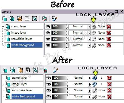

That way when/if we need to move them, they will move together and you won't need to keep matching it up.

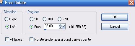
5.  Take your snowflake layer and duplicate it 3 times (so you will have a total of 4 layers).  On the very bottom snowflake layer, go to Image - Rotate and use the following settings:


Photobucket

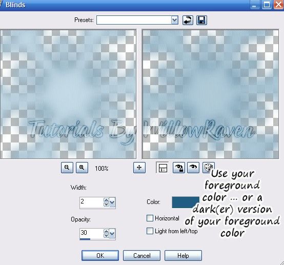
Then resize it by 85%.  Adjust - Blur - Gaussian Blur ... by 10.0 pixels.  Effects - Texture Effects - Blinds with these settings:

Photobucket

Go to the bottom snowflake layer and apply the DSB Flux - Bright Noise filter with the following settings:

Intensity:  50
Direction:  Mix

Apply the same filter on the other 2 layers EXCEPT when you do each layer, click on "Mix" twice before clicking "OK".

(**IF you are using the Noise filter that comes with PSP, go to Adjust - Add/Remove Noise - Add Noise and use the following settings:  Uniform, Monochrome checked ... on bottom snowflake layer use noise of 40%, middle layer use noise of 50%, on top layer use noise of 45%)

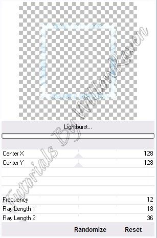
6.  Go to your stamp layer and go to Adjust - Color Balance - Manual Color Correction   ... and color it to complement the colors you are using with your snowflake and image (I am using a icy blue color).  When using this, be sure your source color is the color you are starting with (white, in this case) and the target color is the one you want your frame to be.  Then apply the VM Natural - Lightburst filter with the following settings:

Photobucket

(I'm using mine through Filter Unlimited 2.0 however the settings will be the same regardless of whether you run it through a filter program or directly.)

7.  Copy and paste the snowflake dangle to your tag file.... arrange to top layer and resize as needed.  (I resized mine to 55%.)  Arrange on right side of tag (see mine for idea).

8.  Resize to 500 pixels x 500 pixels ... 72.000 ppi.... Weighted Average ... "all layers" CHECKED.  Feel free to use the crop tool to crop out any additional edges from the tag.  Use the Sharpen option (Adjust - Sharpness - Sharpen) if needed to clarify your layers.

8.  Apply any desired drop shadows to the layers ... I used the following with the Drop Shadow settings:

On stamp frame and dangle:

Vertical and Horizontal:  0
Opacity:  45
Blur:  8.00
Color:  black (or a dark shade of what you are using -- not black unless black is a major color on your tag)

On the noised snowflake layers:

Vertical :  0
Horizontal:  0
Opacity:  55
Blur:  11.00
Color:  #244d64  (I used the dark foreground color I used earlier) 
Shadow on new layer: unchecked

I did not apply any drop shadow to the image or the very bottom snowflake layer (with the gaussian blur and blinds filter).

10.  Apply crediting information and watermark.  If you wish to make this a non-animated tag, close out 2 of the noised snowflake layers, then merge visible.  Apply name text and then you are done!

(If you want to animated the tag, see below)


~Animation Shop Directions ~

If you are wanting to animate your tag, after you apply your crediting information and watermark, do the following.

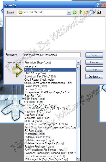
1.  Close out the top and middle noised snowflake layers.  Go to Edit - Copy Merged  ... Edit - Paste as New Image.   Then close out the bottom noised snowflake layer and unhide the middle one.  Go to Edit - Copy Merged.... Edit - Paste as New Layer ... do the same thing for the last noised snowflake layer.  You should now have 3 layers.  When you save, save as "Animation Shop .psp":

Photobucket

Open Animation Shop ....

File - Animation Wizard ... using these settings:

1st window:   Same size as the first image frame (ticked)   (next)
2nd window:  Tranparent (ticked)   (next)
3rd window:   Upper left corner of the frame (ticked) / With the canvas color (ticked)   (next)
4th window:   Yes, repeat the animation indefinitely (ticked) / How long ... : 30   (next)
5th window:   click "Add Image", browse to location of your file then click "open", then "next"
6th window:  Finish

Your animation will now show up in Animation Shop.  

2.  Go to View - Animation to check if it is running at a desired speed.  Feel free to modify the speed if you would like.  (To do that, go to Edit - Select All  (or CTRL + A) and then right click on the first frame and go to Frame Properties and change the number... a smaller number will make it run faster, a larger number will make it run slower. ... when happy with settings, click OK.  You can check them by going to View - Animation.) ... I ended up changing mine to 15.

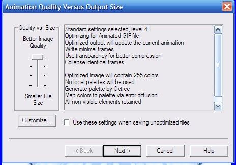
3.  Now, I always save a blank of my tag on my computer so that I can tag it for people later on.  So I will save the tag with the default settings (what AS installed with) ... usually these settings work ok (however red tones are pretty iffy) ... here is what I used:

Photobucket

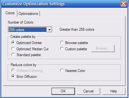
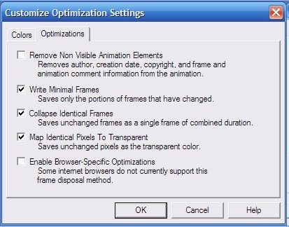
Click on the CUSTOMIZE button and use these settings:

Photobucket

Photobucket

click OK ... all the way until it saves your tag.

Now all you need to do is put the name on it!  Go to PSP and, using your text tool, make up your name.  (I'll give you my settings at the end) ... Once you have your text the way you like, copy it, and then bring it over to Animation Shop and paste it. The click on CTRL + L twice (this will put 2 more layers of your name after the current animation frame, which is your first name frame).

You should now have 3 name frames.  While you have your names active, go to Edit - Select All (or CTRL + A), then Edit Copy (or CTRL + C) .... then go to your tag, click inside the 1st frame, then go to Edit - Select All (or CTRL + A) and then Edit - Paste - Into Selected Frame (or CTRL + E) .... place name where you want ... when happy, left click your mouse... name will place in the frame your own AND the other frames.  Feel free to go to View - Animation to see the tag with name on it.  When happy, save tag with previous settings, being sure to change saved name so that you don't save over your blank template.  (For example, my blank tag is name MIS-Snowtime_ani-blk.gif ... so my tagged tag would be something like MISSnowtimeMisbyWR.gif.)

And you're done!!!

~NOTE~  For name/text:

I did the text at size 56, stroke 2.0 .. foreground and background colors the same as used in tutorial... kern: 0.0

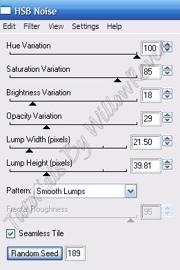
I applied Eye Candy 4000 - HSB Noise with the following settings:

Photobucket

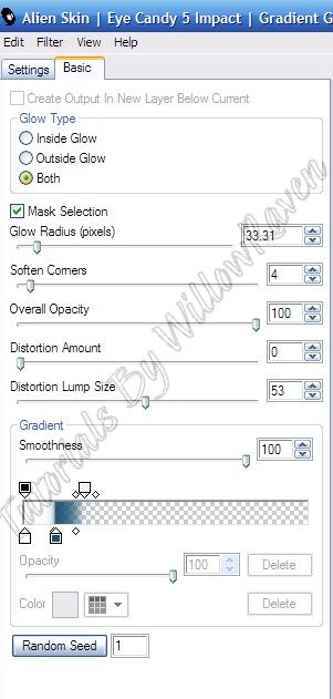
And then I used Eye Candy 5 Impact - Gradient Glow with the following settings:

Photobucket

And then used the following drop shadow

Vertical :  2
Horizontal:  -2
Opacity:  30
Blur:  14.00
Color:  black 
Shadow on new layer: unchecked

and done!

I'd love to see what you come up with and thanks for checking out my tutorial!

Sunday, September 23, 2012

CT Creamsicle Tutorial


CT Creamsicle Tutorial


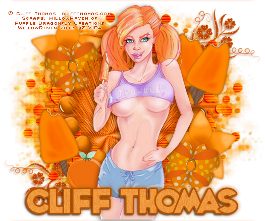
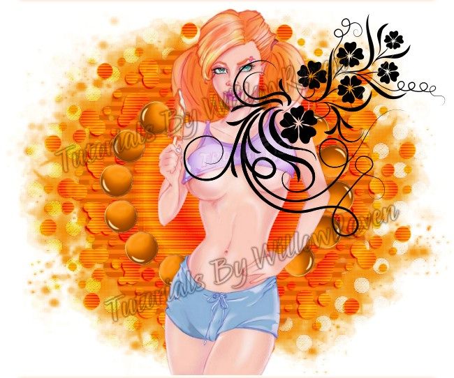
This is the tag we will be making:

Photobucket

Moderate level - Some knowledge of PSP is needed.


Materials Needed

Paint Shop Pro  (used Version 9, but can be done on any version)

PTU kit "Tangerine Dream - Tagger Size" by Purple Dragonfly Creations which can be found HERE  

Tube is "Creamsicle" by Cliff Thomas - you can get this amazing tube at Indie-Zine, HERE

Tag Template #33 by Babes Designz - At the moment, Babe's blog is down, so until such time as her blog is back up and running, I have provided the tag template, HERE

Mask of choice ... I used MelissazCreationz #10, found HERE

Floral Deco Brushes by ro-stock found HERE.  Keep in mind that these are photoshop brushes, which come in .abr format.  You can convert them to .png for PSP usage with an ABR viewer, found HERE.  Once in png format, they can be imported in to your PSP brushes (File - Import - Custom Brush) -- or just use them in png format.  I have also provided the .png in the zipfile with the tag template.


Filters Needed 

Blinds - comes with PSP
Weave - comes with PSP


Fonts used

Ambitsek (for copyright info)
Whoop Ass Font by Blambot Fonts (for name/text), free for personal use 


Please note that I typically add my drop shadows last.  I will give the drop shadow settings that I have used (end of tutorial) HOWEVER feel free to use your own settings if you would like.


1.  Open Tag Template.  Shift+D to duplicate template, then close original, then delete the "copyright", "stitch" and "circle" layers.  At this time, also open your mask and minimize in PSP.

2.  Open paper2... copy & paste it as new layer just above the frame layer.  Resize 85%, be sure all layers is UNchecked.  Click on the circle layer then go to Selections - Select All ... Selections - Float .... Selections - Defloat, then Selections - Invert.  Go to the paper layer and click your Delete button.  Selections - Select None.  Close out the Frame layer.  Duplicate the paper layer, then on the bottom one, go to Adjust - Blur - Gaussian Blur ... by 4 pixels ... click OK.  On the top paper layer, change the layer properties to Luminance (Legacy) at 100% opacity.

3.  Go to you tube and, with your eyedropper tool, pick 2 colors, making the foreground color darker than the background color.  I used two orange shades from her hair to go along with the color palette in the kit.  When done, go to your materials palette, and go to Gradient and choose the following:

Foreground/Background

Style:  Sunburst
Repeats:  8
Invert: not checked
Horizontal:  50
Vertical:  50
Link center and focal points:  checked

Activate the "masked" layer on the template.  Selections - Select All ... Selections - Float .... Selections - Defloat.  Add new raster layer and then flood fill this new layer.  You will actually have to do it several times before you start seeing color showing up (I had to click on it 10 times!).  When satisfied, Selections - Select None.  Change the layer properties to Overlay at 100% opacity.  Duplicate this layer, and then change the layer property on this layer to Burn, 100% opacity.  (So, in all you will have 2 layers of the flood filled layer, plus the original "masked" layer.)  Apply the following drop shadow to the "burn" layer:

Vertical: 2
Horizontal:  -2
Opacity:  65
Blur:  2.00
Color:  Darkish Orange (#9a4202) ... you will want a darker shade of what you used for this layer
Shadow on new layer: unchecked

While still on the "burn" layer, go to the Blinds filter that comes with PSP and apply the following settings:

Width:  4
Opacity:  50
Color:   Darkish Orange (use the same that you did for the drop shadow)
Horizontal:  checked
Light from left/top:  unchecked

Click OK, then apply again.

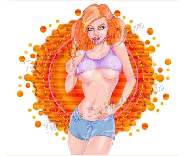
4.  Copy/Paste your tube to your template, move to the top.  Resize by 77% and place in the middle as best you can.  It should now look something like this:

Photobucket

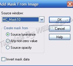
5.  Copy and paste Paper12 as a new layer and then, in the layer palette, go to Arrange - Send to bottom.  Go to Layers - New Mask Layer  - From Image and use the following settings:

Photobucket

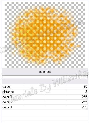
Merge - Merge Group.  Apply Penta.com - Color Dot filter with the following settings:

Photobucket

(I use mine through Filters Unlimited so my filter 'screen' may look different than yours. ...just apply the same settings and you should be fine.)

Duplicate mask layer, move duplicate under the original mask layer.  With the duplicate layer, go to Adjust - Blur - Gaussian Blur  ... by 2 pixels - click OK.  On the top layer, change the layer properties to Darken, 100% opacity.

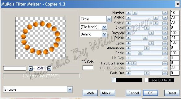
6.  Copy and paste element #7 to template, move to top.  Apply Mura's Meister Copies with the following settings:

Photobucket

move the circle of 'brads' under your tube.

7.  Open your Deco Floral Brush by Ro-Stock.  Keep in mind that these are photoshop brushes, which come in .abr format.  You can convert them to .png for PSP usage with an ABR viewer, found here:  http://www.g1ga.it/abrviewer/ .  Once in png format, they can be imported in to your PSP brushes (File - Import - Custom Brush) -- or just use them in the png format.  I converted the .abr quite a ways back and did not import them as brushes, so I am just using the .png file.  Given that information, take the floral deco and copy and paste as new layer to your template - move to top layer, then move the deco to the upper right corner, like this:

Photobucket

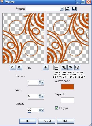
Duplicate, then flip, then mirror, so you will have it going from the bottom left to the upper right.  Merge - Merge Down.  Adjust - Color Balance - Manual Color Correction - change it to a color that complement the colors you are using (make it a medium to dark shade).  Using the Weave filter that comes with PSP, apply the following settings:

Photobucket

Then move them just below the [closed out] frame layer.

8.  At this point, continue to decorate the tag as desired with supplied elements.  Because of the theme of the kit and the tube, I was sure to use the Creamsicle Ice Cream in the kit.  When you are satisfied, resize to 525 pixels x 438 pixels ... 72.000 ppi.... Weighted Average ... "all layers" CHECKED.  Feel free to use the crop tool to crop out any additional edges from the tag.  Use the Sharpen option (Adjust - Sharpness - Sharpen) if needed to clarify your layers.

9.  Apply any desired drop shadows to the layers ... I used the following with the Drop Shadow filter that comes with PSP on all layers EXCEPT my tube layer, the "masked" layers, the frame layer and the actual mask layers:

Vertical and Horizontal:  0
Opacity:  70
Blur:  7.00
Color:  #9a4202  (or a dark shade of what you are using -- not black unless black is a major color on your tag)

On the top "Frame" and "floral deco" layers, I used the following drop shadow settings:

Vertical :  3
Horizontal:  -3
Opacity:  50
Blur:  4.00
Color:  #9a4202  (same that I used, above) 
Shadow on new layer: unchecked


On the tube layer, I applied the following:

Vertical :  3
Horizontal:  -3
Opacity:  50
Blur:  18.00
Color:  black 
Shadow on new layer: unchecked

I did not apply any drop shadow to the very bottom mask layers.

10.  Apply crediting information and watermark.  When satisfied, merge visible.  (If you wish to make this a tag with a transparent background, be sure to close out the white 'background' layer before merging.)  Apply name text and then you are done!

~NOTE~  For name/text:

I did the text at size 48, stroke 3.0 .. foreground color:  #b45000 ... background color was Paper7 from kit at 50% (size) .... kern:  0
Then I duplicated the name/text and then, on the bottom one I applied the following gaussian blur:  by 4.00 pixels
and then on the top name/text I applied the following drop shadow:

Vertical :  2
Horizontal:  -2
Opacity:  60
Blur:  4.00
Color:  black 
Shadow on new layer: unchecked

and done!

If you try my tutorial, I would love to see what you come up with!


Wednesday, August 1, 2012

CL Pink Yuki Tutorial


CL Plaid Yuki Tutorial

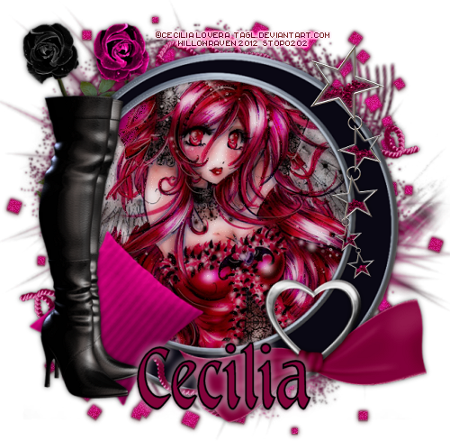
This is the tag we will be making:

Photobucket


Moderate level - Some knowledge of PSP is needed.


Materials Needed

Paint Shop Pro  (used Version 9, but can be done on any version)
PTU kit "Plaid Princess - Tagger Size" by Sweet Southern Comfort Creations, found here
Tube is "Kit Jo Yuki" by Cecilia Lovera - you can get this beautiful tube at PSP Tube Shop, here
Mask of choice ... I used Trese Mask #0074, found here


Filters Needed 

Tramages - Pool Shadow
Xero - Porcelain
Drop Shadow (found in the PSP program)


Fonts used

 Rittswood Impresive (for copyright info)
Tarragon ICG (for name/text)


Please note that I will give the drop shadow settings that I have used HOWEVER feel free to use your own settings if you would like.


1.  Open PSP.  Open New File:  650 pixels x 650 pixels, 72.000 pixels/inch resolution, transparent.  At this time, also open your mask and minimize in PSP.

2.  Open roundframe6... copy & paste it as new layer.  Resize 85%, be sure all layers is UNchecked.  Copy and Paste Paper 1 (ppr_1) as a new layer, move just under the frame.  In your layer palette, close out the paper layer and make the frame layer active and then, using your magic wand, click inside of the frame. Go to Selections - Modify - Expand ... by 8 pixels ... click OK.  Go to Selections - Invert.  In your layer palette, click on your paper layer and then click on your Delete button (you will see all the paper outside of the frame disappear so only the middle part remains).

3.  Copy and Paste Paper 12 (ppr_12) as a new layer and then, in the layer palette, go to Arrange - Send to bottom.  Go to Adjust - Blur - Motion Blur and use the following settings:

Angle:  120.00      Strength:  75%

Click OK, then go to Adjust - Blur - Motion Blur and use the following settings:

Angle:  303.00      Strength:  50%

Click OK.

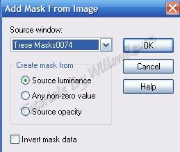
4.  Go to Layers - New Mask Layer  - From Image and use the following settings:

Photobucket

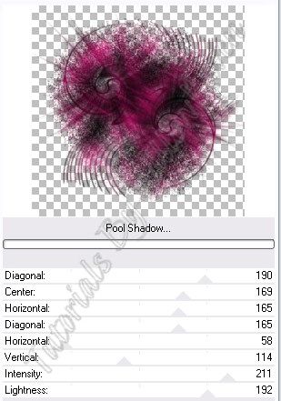
Merge - Merge Group then resize by 102%.  Duplicate mask layer, move duplicate under the original mask layer.  With the duplicate layer, go to Adjust - Blur - Gaussian Blur  ... by 2 pixels - click OK.  With the original mask layer, apply the Tramages - Pool Shadow filter with the following settings:

Photobucket

(I use mine through Filters Unlimited so my filter 'screen' may look different than yours. ...just apply the same settings and you should be fine.)

Duplicate mask layer, move duplicate under the original mask layer.  With the duplicate layer, go to Adjust - Blur - Gaussian Blur  ... by 2 pixels - click OK.


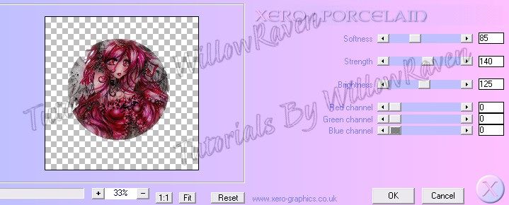
5.  Activate your paper layer then go to Selections - Select All ... Selections - Float .... Selections - Defloat.  You will see marching ants that are in the shape of the circle your paper is in.  Copy and paste your tube/image so that it is the layer *just* above the paper layer (and below the frame layer) .... go to Selections - Modify - Expand .. by 5 pixels. Then go to Selections - Invert ... then, making sure your tube layer is active, click delete.  Duplicate your tube layer.  Bottom one, go to Adjust - Blur - Gaussian Blur ... by 3 pixels...click OK.  Then on the top tube layer go to Xero - Porcelain and use the following settings:

Photobucket

Change to layer properties to Difference, opacity 100.

6.  Copy and paste the Spiral Scatter, move to just above the top mask layer.  Move it around so the upper right 'corner' is visible beyond the outer edge of the frame.  Go to Adjust - Brightness and Contrast and apply the following settings:

Brightness:  10      Contrast:  15

Click OK.

Duplicate scatter layer, then go to Image - Flip ... and then Image - Rotate.  Merge Down the top scatter layer to the bottom scatter layer (so the scatters are now on 1 layer).  Duplicate the scatter layer.  On top scatter layer, change properties to Screen, 95 opacity.  On bottom scatter layer, go to Blur - Gaussian Blur - by 2 pixels.

7.  At this point, continue to decorate the tag as desired with supplied elements.  When you are satisfied, resize to 500 pixels x 500 pixels ... 72.000 ppi.... Weighted Average ... "all layers" CHECKED.  Feel free to use the crop tool to crop out any additional edges from the tag.  Use the Sharpen option (Adjust - Sharpness - Sharpen) if needed to clarify your layers.

8.  Apply any desired drop shadows to the layers ... I used the following with the Drop Shadow filter that comes with PSP on all layers EXCEPT my tube layer, the paper background layer, the bottom scatter layer and the 2 mask layers:

Vertical and Horizontal:  0
Opacity:  60
Blur:  8.00
Color:  black
Shadow on new layer: unchecked

On the top tube layer, I applied the following:

Vertical :  1
Horizontal:  0
Opacity:  50
Blur:  3.00
Color:  #360208  (I chose a very dark color from my tube, but not black)
Shadow on new layer: unchecked

9.  Apply drop shadow a second time to top tube layer.  Do not apply any drop shadow to bottom tube layer.  Do the same thing with the 2 scatter layers... apply the tube drop shadow settings to the top scatter layer (twice) except change the blur to 1.00  ... leave bottom scatter layer untouched.

10.  Apply crediting information and watermark.  When satisfied, merge visible.  Apply name text and then you are done!


I would love to see what you come up with if you try my tutorial!!!


Wednesday, June 27, 2012

AKY Take Me Out to the Ballgame Tutorial


Take Me Out to the Ballgame Tutorial

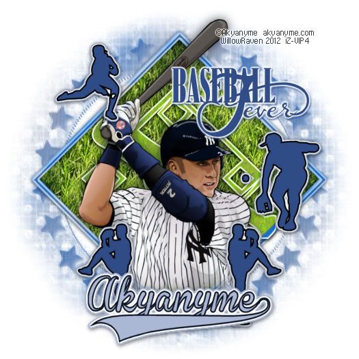
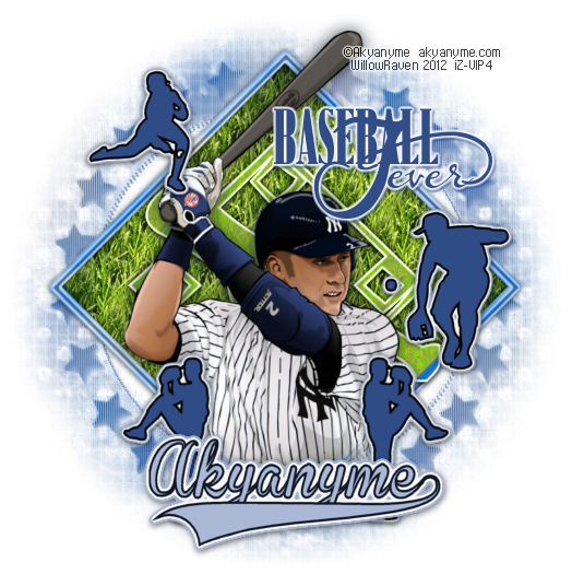
This is what we will be making 

Photobucket


Moderate level - Some knowledge of PSP is needed.


Materials Needed:

Paint Shop Pro  (used Version 9, but can be done on any version) 
Tube "Derek Jeter" by Akyanyme, which is an FTU licensed image at Indie-Zine, found here. Even though it is free, you must still have a license to use work from this artist.  License is also free by contacting customer service
Baseball Fever" Word-Art (Freebie!) from Bekah & Designs, found here at bottom of post
Dingbat baseball elements and grass pattern in zipfile, HERE

Filters Needed:  

Blinds (comes with PSP)
Mosaic - Antique (comes with PSP)
Drop Shadow (comes with PSP)
Xenofex 2 - Little Fluffy Clouds
Eye Candy 5 Impact - Gradient Glow

Fonts used:

FFF Executive for copyright info
Baseball and KR All Sports for the dingbat images
Brannboll Fet for the name/text


Please note:  I tend to make the whole tag first, and then apply drop shadows to the items I wish to drop shadow.  If you wish to apply them as you go along, that is fine, too!  My drop shadow settings are towards the bottom of the tutorial if you would like to use what I have used.


Directions

1.  From my zipfile, put the "Grass" jpg in your patterns folder.  Open PSP.  Open New File, 800 pixels x 800 pixels, 72 pixels/inch resolution, transparent.  (Don't worry, we will be resizing it later on.)  Open your mask, and minimize in PSP.  Also open up word art and minimize that in PSP.

2.  In your materials palette, make black your foreground and medium gray your background, then activate your preset tool and click on square with the following settings:

Photobucket

While still in vector format, go to Objects - Align - Center in Canvas.  Then go to Image - Rotate - Free Rotate 45 degrees, left .. all layers UNCHECKED.  Convert layer to raster.  Name this layer "template".

3.  With your magic wand, click on the medium gray center.  Selections - Modify - Expand: 2.00.  Layers - New Raster Layer.  Go to your materials palette and in one of them (doesn't matter which), choose the grass pattern with the following settings:

Angle:  0
Scale:  50
Texture:  unchecked

flood fill the area with the grass pattern.  Select - Select none.  Rename this layer "grass".

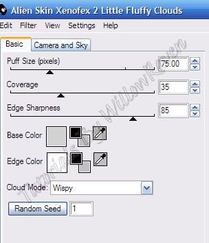
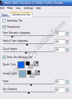
4.  Go back to your original square, click on the black outline with your magic wand.  Layers, new Raster Layer twice.  On one of the new layers go to Selection - Modify - Expand, by 2.00 pixels, and then go to Xenofex 2 - Little Fluffy Clouds and apply the following settings:

Photobucket  Photobucket

Select - Select none.  Rename this layer "clouds".  On the second new layer, go to Selection - Modify - Contract:  3.00 pixels.  Flood fill with darker blue color (I used #220eb8).  Selections - Select None.  Move this layer above the "clouds" layer and rename the dark blue layer "border".

5.  In your materials palette, make your background color #2138c5 and your foreground color white  (If you are using the element I gave you - AKY_KR-BaseballDiamond.psd - go to the * areas in parenthesis and disregard how to create it).  Using the "KR All Sport" font (* or using the baseball diamond element I enclosed in the zipfile) - create as vector (using the capital "B"") with the following settings:

Photobucket

Objects - Align - Center in Canvas.  (* if you are using the element I gave you, just center it as best as you can over the grass area.)  Convert to Raster (if creating your own).  In your layer palette, change properties to:

Blend Mode:  Luminance  (Luminance Legacy also works well)
Opacity:  100  
Layer is visible:  checked

Rename the element layer "diamond"  and move it to just above the "grass" layer if its not already.  Change the properties of the "grass" layer as follows:

Blend Mode:  Multiply
Opacity:  100
Layer is visible:  unchecked

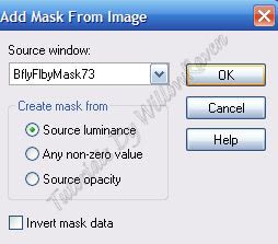
6. Go to Layers - New Raster Layer, then move to the bottom.  Go to Xenofex 2 - Little Fluffy Clouds and apply previous settings.  Adjust - Blur - Gaussian Blur:  10.00. Go to Layers - New Mask Layer - From Image and apply these settings:


Photobucket
  
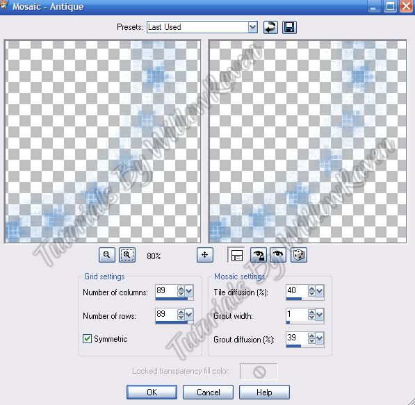
Merge - Merge Group.  Duplicate.  On bottom one - Adjust - Blur - Gaussian Blur:  3.00. Rename layer "Mask 2". Then go to Mosaic - Antique (comes with PSP) and apply the following settings:

Photobucket

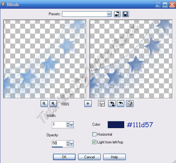
Lower the opacity to about 70.  On top mask clouds layer, use the Blinds effect (that comes with PSP) with the following settings:

Photobucket

Adjust - Sharpness - Sharpen.  Rename layer "Mask 1".

At this point you will probably have an empty raster...go ahead and drop that down to the very bottom and - if desired - flood fill it with white.  You should now have something like this:

Photobucket

You can also close out your black/gray square "template".

6.  Open your tube and copy it to your tag layers.  Name this layer "tube".  Resize it 90%, then center it.  Activate your eraser tool with the following settings:

Shape:  round
Size:  50
Hardness:  10
Step:  25
Density:  100
Thickness:  100
Rotation:  0
Opacity:  25

along the bottom of the tube soften the edges and the bottom 'line' so that it looks more blended with the rest of the tag:

Photobucket

7.  In your materials palette, choose black for foreground and #304c86 for background.  (If you are using the elements I provided in the zipfile, you can pass #7 - just copy and paste the silhouettes on to tag as desired.)  Use the following settings as well:

Photobucket

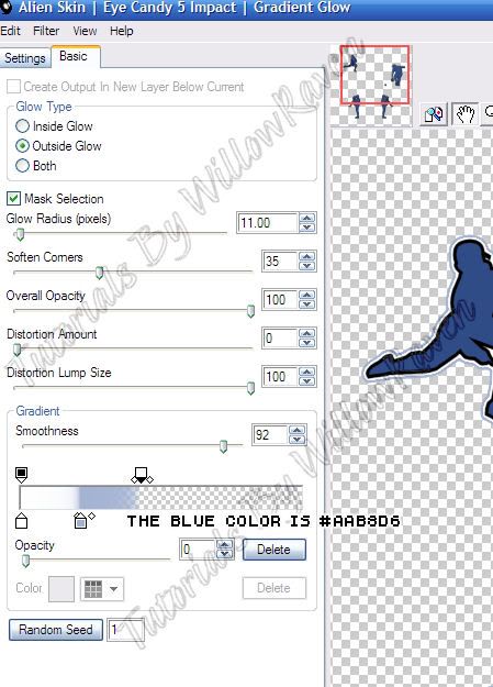
Use the Baseball font (has the silhouettes of baseball players) and choose 2 or 3 positions and place around the tag as desired.  Convert to raster when you are happy with look and placement.  Merge down all of them to 1 layer.  Then go to Eye Candy 5 Impact Gradient Glow and apply these settings:

Photobucket

At this point, resize your total tag to 525 x 525 pixels, 72.000 ppi ... all layers CHECKED.  Be sure to sharpen each layer as needed.  

8.  Maximize your word art.  Shift + D to make a copy, close original.  Resize it to 200 pixels x 101 pixels, and be sure to change the ppi to 72.000 - Resample using: Weighted Average  and all layers checked.  Go to Adjust - Color Balance - Manual Color Balance and use the following settings:

Source color:  black
Target color:  #304c86

(don't have to worry about other settings) .... click "OK".  Copy and paste as new layer to your tag.  Move to upper right (see my tag for idea) ... then apply Eye Candy 5 Impact Gradient Glow using the previous settings.  Also apply the gradient glow to the blue line border layer and set the property for that layer to Luminance (Legacy), Opacity: 50 .

9.  At this point, you are pretty much done with the tag itself.  Feel free to apply desired drop shadows to layers - I used the following:

for all layers except tube layer, word art layer and mask 1 layer (no drop shadow at all on mask 2 layer):

Vertical:  1
Horizontal: 0
Opacity:  75
Blur:  7.00
Color:  black
Shadow on new layer: unchecked

for tube layer:

Vertical:  0
Horizontal: 0
Opacity:  75
Blur:  22.00
Color:  #0f1625  (very dark blue)
Shadow on new layer: unchecked

for word art layer and mask 1 layer:

Vertical:  2
Horizontal: 1
Opacity:  70
Blur:  2.00
Color:  #304c86  (medium to dark blue)
Shadow on new layer: unchecked


10.  Add your copyright information to your tag.

11.  For text on tag, I used Brannboll Fet at size 36, 2.0 stroke, color #0f1625 for foreground and #aab8d6 for background.  (To get the little 'swish' under the name, type in one of the numbers above the alpha pad - each number makes a different 'swish'...don't put a space between the last letter and the 'swish' number.)  Placed it as desired, then did Object - Align - Horizontal Center in Canvas.  Convert to Raster.  Then I used Eye Candy 5 Impact - Gradient Glow with the previous settings, then applied the following drop shadow settings:

Vertical:  2
Horizontal: 1
Opacity:  50
Blur:  8.00
Color:  black
Shadow on new layer: unchecked


Go to Edit - Copy Merged and then save that as jpg. *or* close out white background and save as a .png with a transparent background.

And here it is with transparent background (jpg background at top of tutorial):

Photobucket

And that is it!!  

I hope you enjoyed the tutorial and would love to see your results!