Saturday, October 24, 2009
Rock Revolution Tutorial
Rock Revolution Tutorial
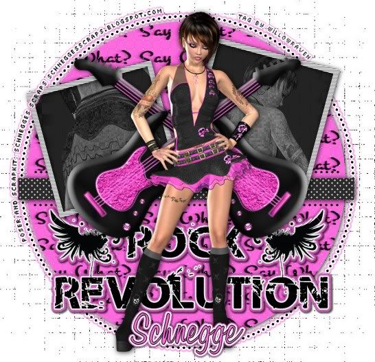
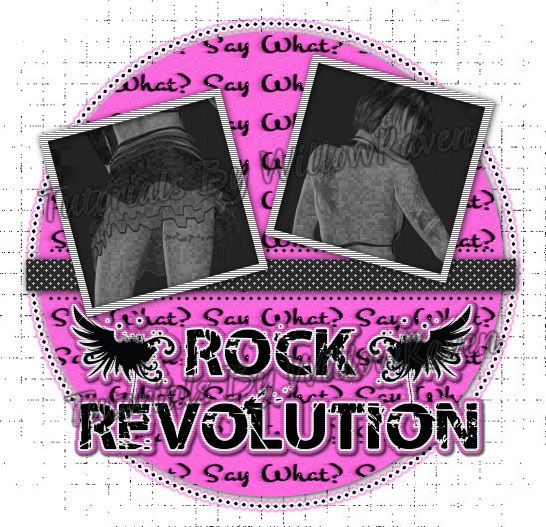
This is the tag that we will be making:
Moderate level - Some knowledge of PSP is needed.
Materials Needed
Paint Shop Pro (used Version 9, but can be done on any version)
PTU kit "Say What" by Schnegges Scraps which can be bought at Dreaming Scrappers
Missy Tag Template # 239 from Divine Intentionz
Tube of choice (I am using posers that came with scrap kit)
Filters Needed:
Weave (comes with PSP)
Blinds (comes with PSP)
Eye Candy 5 Impact - Gradient Glow
Xero Fritilliary (freeware)
Fonts used:
Pixelette (for copyright info)
Waugh (for name/text)
DIRECTIONS
1. Open PSP
2. Copy Template then click on Shift + D to duplicate entire template. Close original template.
3. Go to Paper #17 from the kit - Copy, then go to the template and Paste as New Layer. Rename it Paper 17. Resize (Image - Resize) 78%, All Layers UNchecked.
4. Make large circle layer active then go to Selections - Select All.... Selections - Float .... Selections - Defloat.
You will now have marching ants around the pink circle. Make the Paper 17 layer active by clicking on it.
5. Selections - Invert. Click on the Delete Button. Paper 17 should now be where the pink circle now is/was.
Go to Selections - Invert. Now the inside of circle is active again.
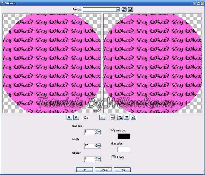
6. Go to Effects - Texture Effects - Weave and use the following settings:
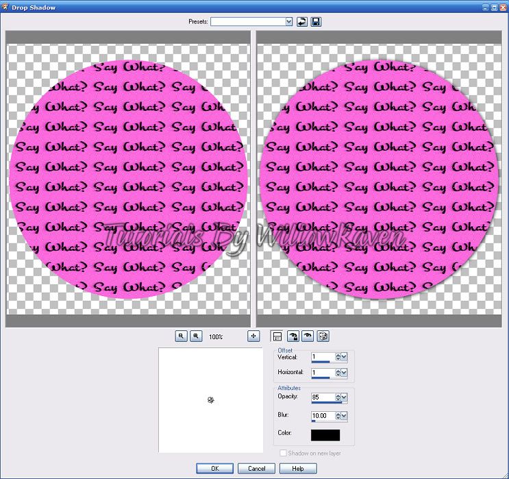
7. Do drop shadow on the Paper 17 circle with these settings (which is used often in this tutorial):
8. Selections - Select None.
9. Copy Paper 10 and Paste as New Layer into the template - move it down to just above the background layer. Rename it Paper 10. Resize (Image - Resize) 78%, All Layers UNchecked.
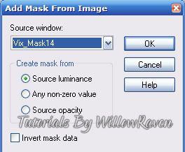
10. Open Mask in PSP, then minimize. Go to Layers - New Mask Layer - From Image and use these settings:
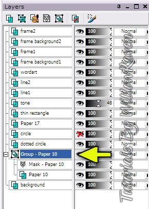
11. Go to Layer Palette, click on the Group - Paper 10:
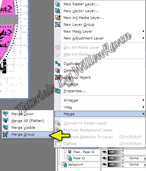
12. Then 'right click", go to Merge - Merge Group:
13. Go to template - click on Frame1 and move it to just under Frame 2. Click on Frame 2 layer, then right click, Merge - Merge Down. Now both of the white frame squares are on the same layer. Rename it "frames".
14. In the layer palette, click on the 'Frame Background2' layer. Be sure the "Frame Background 1" layer is right under it, then right click - Merge - Merge Down. Now both of the blue squares are on the same layer. rename it "frame backgrounds".
15. Copy Paper 04, then Paste as New Layer on the template. Move it to just above the "frame backgrounds" layer. Rename it Paper 4. Resize (Image - Resize) 70%, All Layers UNchecked.
16. Go to the "frame backgrounds" layer - make active - then go to Selections - Select All.... Selections - Float .... Selections - Defloat.
17. Click on Paper 4 layer, then go to Selections - Invert. Click on the Delete Button. Selections - Select None.
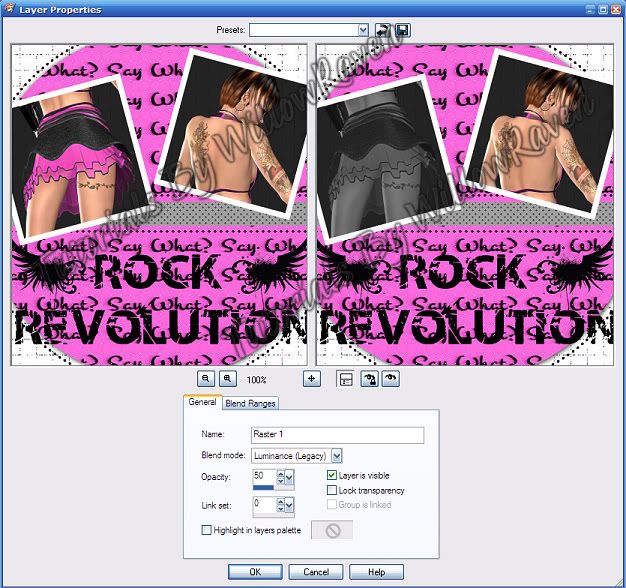
18. Click on the left square to make it active then paste one of your tubes onto your template (I used Poser 2). Place it over the left square frame. Get it to how you want it to look. Then go to Selections - Invert. Click on the Delete Button. Selections - Select None. Rename this "left square". Right click on the layer in the layer palette, then go to Properties and use these settings:
19. Do the same thing for the other blue square and rename it "right square".
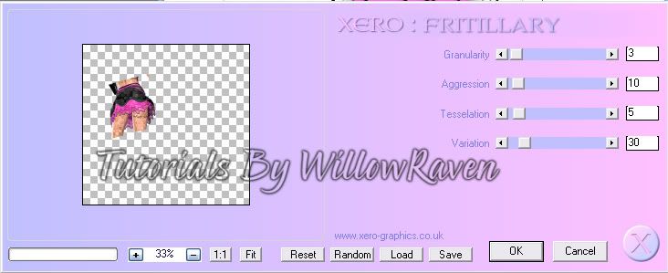
20. Click on the left square tube - go to Effects - Xero - Fritilliary and use the following settings:
21. Repeat for the right square tube.
22. Close off the blue "frame backgrounds" layer (put the red 'x' over the eye in the layer palette).
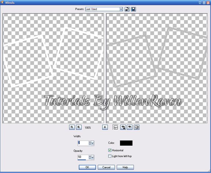
23. Click on the "frames" layer. Go to Effects - Texture Effects - Blinds and use the following settings:
Use the drop shadow settings we used earlier.
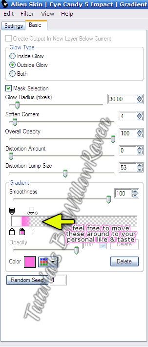
24. Click on Word Art Layer - make active. Use Eye Candy Impact 5 - Gradient Glow with the following settings:
(the pink color I used is: #ff6be0)
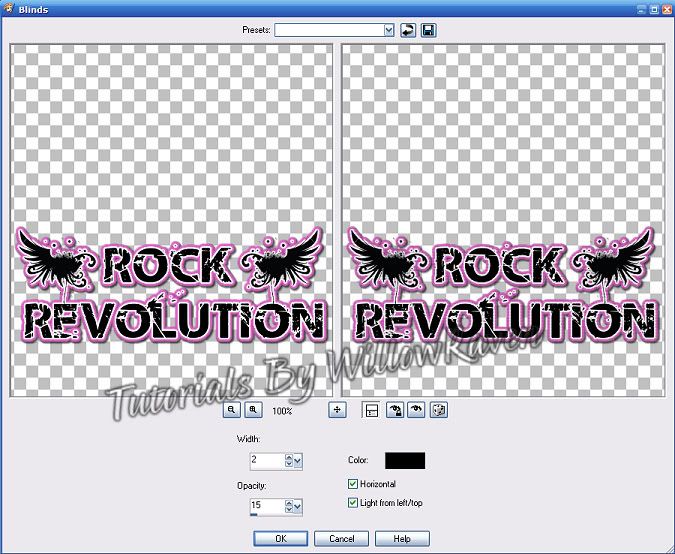
Use the drop shadow settings we used earlier EXCEPT change the blur to 2.00. Then go to Edit - Repeat Drop Shadow. Go to Effects - Blinds and use the following settings:
25. Click on the 'thin rectangle' layer and make active. Go to Adjust - Color Balance - Manual Color Balance. Change it from Gray to Black. Use drop shadow settings from earlier.
26. Click on the "tone" layer and make active. Go to Adjust - Color Balance - Manual Color Balance. Change it from black to white. Change opacity of layer to 65.
27. Copy your other tube and paste as new layer to template - bring to top. Resize (Image - Resize) 85%, All Layers UNchecked. Move to middle (roughly) of template. Apply drop shadow settings.
28. Go to 'dotted circle' layer - make active. Use Gradient Glow settings you use previously EXCEPT change overall opacity to 50, and make the pink outer layer smaller.
29. You should now have something like this:
30. Copy guitar element, then paste as new layer onto template, move just under your main tube. Rotate (Image - Rotate - Free Rotate) to the right by 20, all layers UNchecked:
Move guitar so that the body of it us just under the right square. Use drop shadow settings from before, then duplicate the guitar, and then mirror it (Image - Mirror).
31. Add any other elements you would like at this point.
32. Add copyright information, scrap designer information, tagger watermark.
33. Merge - Merge All Visible. Save as .jpg.
Additional - for name/text
1. Using the Waugh font, black for foreground and #ff6be0 for background, size 56, stroke width 1.0, make the name. Try to center it roughly in the center of the bottom (see tag for idea). Right click on the name, then go to Align Object - Align Horizontal Center in Canvas. This will make sure it is in the center of that particular area. Convert layer to raster.
2. Go to Effects - Eye Candy Impact 5 - Gradient Glow. Use previous settings, changing the Overall Opacity back to 100. Use Drop Shadow with the following settings:
Vertical and Horizontal: 0
Opacity: 85
Blur: 3.00
Color: black
Shadow on new layer: unchecked
3. Go to Edit - Repeat Drop Shadow.
And you are done!!
I would love to see your results!
Feel free to comment and thank you for checking out my tutorials.
Saturday, October 10, 2009
Creative Teams!!
I am just writing to let you all know that I have joined 2 new creative teams and I'm very excited about this! The first one is Katelynn's Designs Store, which can be found HERE. They have a lot of wonderful designers and beautiful kits so be sure to check them out!
The second one is a scrap designer who is selling some kits at Mistaken Art. Her name is Ruby who goes by the name Designs by Ruby, and she has some gorgeous, creative kits, and I'm really looking forward to creating with them!
I plan on working on some stuff over the weekend and into the week. Keep your eyes posted here for new stuff!!
Posted by WillowRaven at 5:18 PM 0 comments
Labels: CT , Designers , Info , Katelynn's Designs Store , News
Subscribe to:
Comments
(
Atom
)

